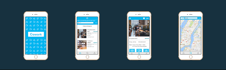
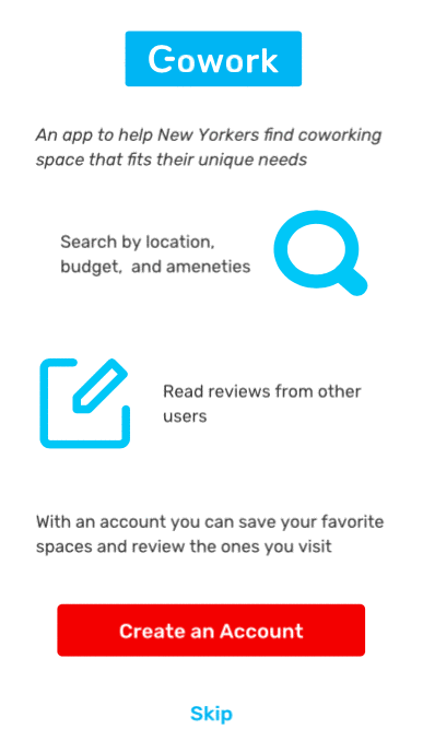
Gowork is a location-based custom app to help New Yorkers find and compare coworking spaces. I researched, designed and prototyped this app as an individual four-week concept project.
Research | Information Architecture | Visual Design | Prototyping
While there are an incredible number of coworking spaces available in New York, there are surprisingly few resources to help New Yorkers find the right coworking space for them. As a design challenge, I set out to research, design, and prototype a location-based app that users to identify and compare coworking spaces in New York City.
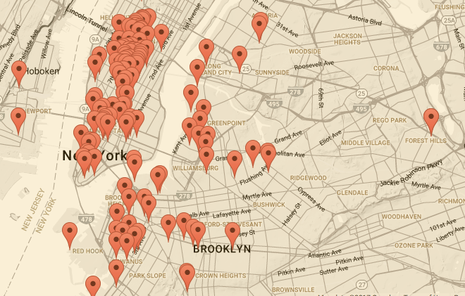
A map of coworking spaces in NYC, from The New Worker.
I structured this project around the following user problems:
- Users want to find coworking spaces that are geographically convenient
- Users want to view the details of the space and easily compare it to other spaces
- Users want to easily save and share the coworking spaces they find
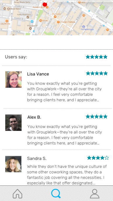
- Users want read reviews of these spaces, and write their own reviews after using them
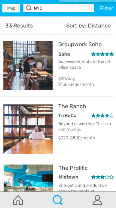
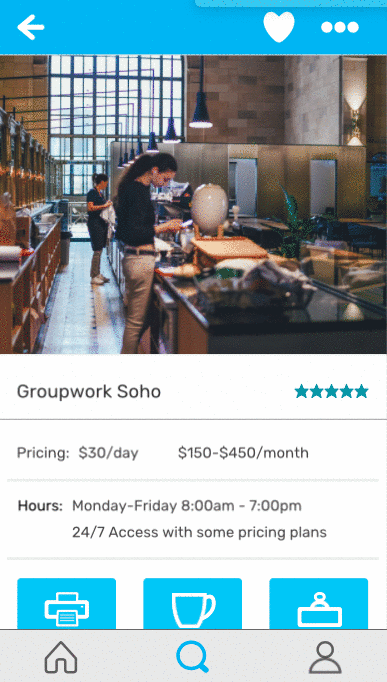
The location-based app I ultimately designed solves a two-sided problem: it both represents what the coworking industry currently offers freelancing New Yorkers, and prioritizes the features people considered most important when choosing a workspace. With Gowork, users are able to easily search by location, filter by price and features, and read what other users have to say about their experience at different spaces. Moreover, with an account they can save workspaces they are interested in, and write their own reviews to contribute to the broader community.
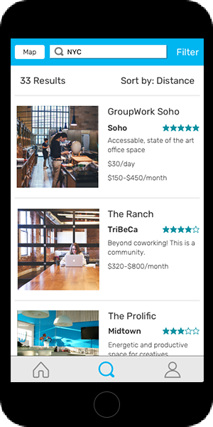
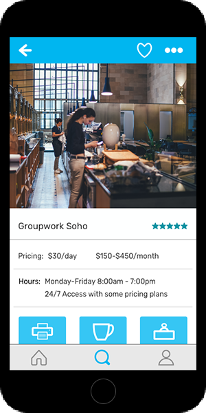
A preview of how to filter search results and favorite a coworking space in the final prototype.
The first step was to look at what coworking spaces in New York offer their users. To do this, I assessed five coworking options by price, location, and amenities. I selected a major chain/name brand site (WeWork), a smaller, lesser known chain (Spacious), and three individual sites (The Productive and The Farm in Manhattan, and Bat Haus in Brooklyn) to keep this data representative. You can see my assessment here.
To get a sense of what similar apps in other verticals prioritize, I conducted a benchmark study of Yelp, Aribnb, Seamless (a food ordering app) and StreetEasy (a New York-based real estate app).
Primary search options |
Location
|
Secondary search options |
Price
|
Filters for results |
Best match
|
Info requested for account setup |
Username
|
*Not applicable building this app.
After conducting market research, I had enough information to build a framework for my user research. I was well versed in what features coworking spaces offered, where they were located, and the numerous pricing plans they offered, but I did not know how users prioritized these. But I still needed to understand what users wanted to know about coworking. Accordingly, I built a survey to answer the following questions:
- How interested are users in coworking, and how frequently would they utilize a coworking space?
- Which features are most important when users choose a coworking space?
- Which amenities would they most like to have in a coworking space?
- How likely would they be to use a coworking space to work with others?
I circulated the survey amongst a group of students and freelance/remote professionals. Results showed that 75% were interested in coworking and would ideally like to use a coworking space more than once a week.
Respondents were asked to prioritize a standardized list of coworking features and amenities based on the five coworking spaces I had assessed. Unsurprisingly, people chose pricing and location as the most important consideration when choosing a coworking space. There was a significant drop off between these two and the other choices. Ultimately, when respondents’ responses were averaged the features were prioritized as follows (in order of highest to lowest priority):
- Pricing
- Location
- Reserved seating
- User reviews
- Available amenities
- Accessibility outside business hours
More surprisingly, the most popular amenities people wanted a coworking space to have were printing and scanning services, available refreshments, and presentation and meeting rooms. The full list of amenities, in order or highest to lowest priority, was as follows:
- Printing/scanning Services
- Available refreshments
- Presentation and meeting rooms
- Space to collaborate with colleagues
- Social/community events (e.g. happy hours, networking opportunities, brown-bag lunches)
- Package and mail delivery services
Finally, while the majority expressed interest in using a coworking space to collaborate with colleagues or meet with clients, this was generally expressed as being “somewhat interested” as opposed to “very interested.”
After gathering this information from the survey respondents, I condensed the most popular responses into three personas.
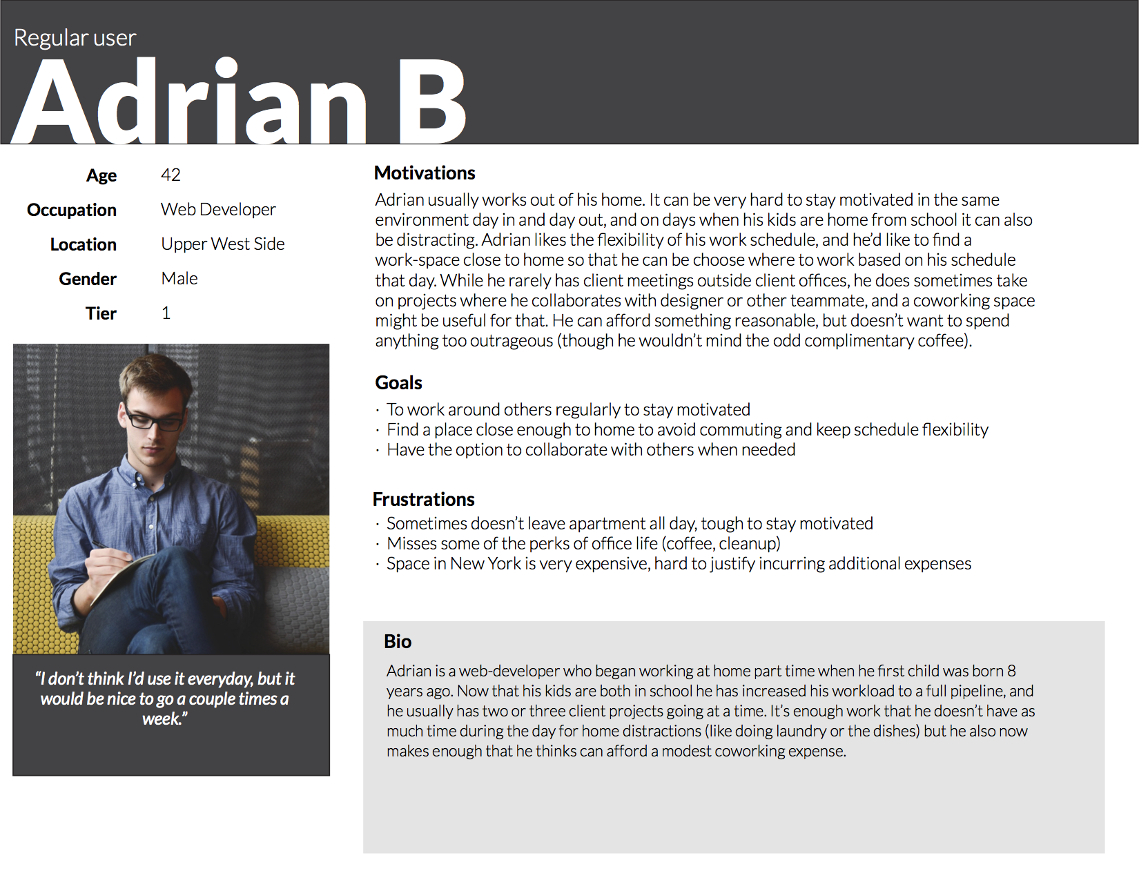
User persona for minimum viable product
Adrian B. is the primary guide for the minimum viable product (MVP) of this app. He usually works autonomously, is budget conscious, and wants some of the perks of an office, but closer to home and with greater flexibility. I used Adrian’s persona to help with the prioritization of user stories and flows in the next section
The initial list of User Stories took into account all my findings from my primary and secondary research.
I used the survey results to prioritize features for the initial MVP. In the example below, I prioritized filters that users should have to narrow their search results. The items highlighted in red are the most critical, and were included in this MVP. Yellow highlighted items are secondary features, and the blue are the least critical.
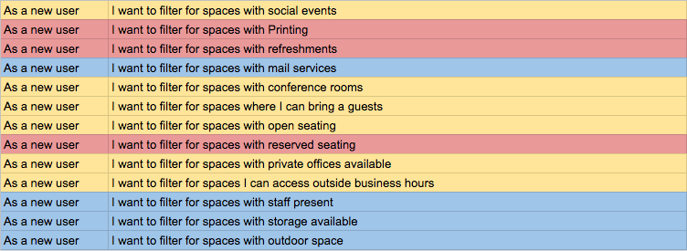
Prioritized user stories.
I prioritized the two most popular amenities, printing services and available beverages, and grouped them with reserved seating for the initial amenities. I chose to move reserved seating from a feature to an amenity to condense the number of filters in the search functionality of the app, and because on further review it seemed to fit better with amenities. The other features have a universal aspect (hours, pricing, location) that could easily be found in any industry, but reserve seating is more specific, and in hindsight fit better with amenities.
Accessibility outside business hours: while this scored relatively low overall on features, I opted to keep in the MVP for three reasons:
- A significant minority ranked it as their number 1 consideration (around 10% of respondents).
- My benchmark study of apps in other verticals indicated hours of operation is a standard feature, leading to the concern users would expect to see it.
- Research into the freelance/independent workforce indicated that many work irregular hours or are freelancing part-time/on top of daytime commitments. This lead me to conclude that despite the survey results a significant number of users might find this an important consideration.
After creating the user stories it was time to map out the user flows:
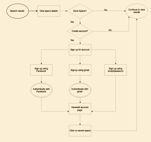
Flow demonstrating what would happen to a new user (with no account) searching and saving coworking spaces.
It was important to me that users who don't initially create an account would still be able to search and filter for coworking spaces. The benefits of having an account are being able to save your favorite spaces and review the ones you have visited. However, given the newness of the app concept I wanted to account for the fact that users may want to explore the app and its features before signing up, and allow them to do so, rather than lose them at the onboarding.
Once my user flows were finalized, it was time to begin visualizing my app. I sketched out wireframes of each of the pages in Balsamiq, and once that was completed I made a quick prototype in InVision to spot-check I hadn’t left out any crucial steps or images.
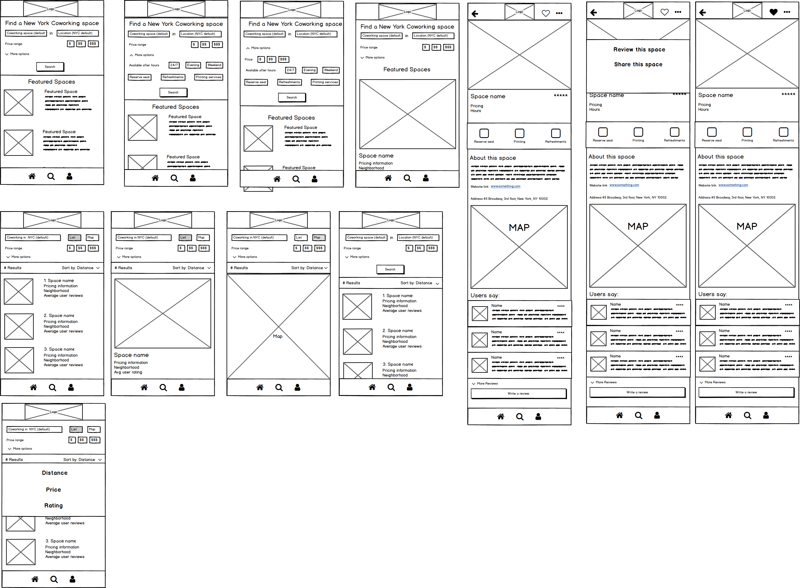
Initial wireframes for the page, search results, filters, etc.
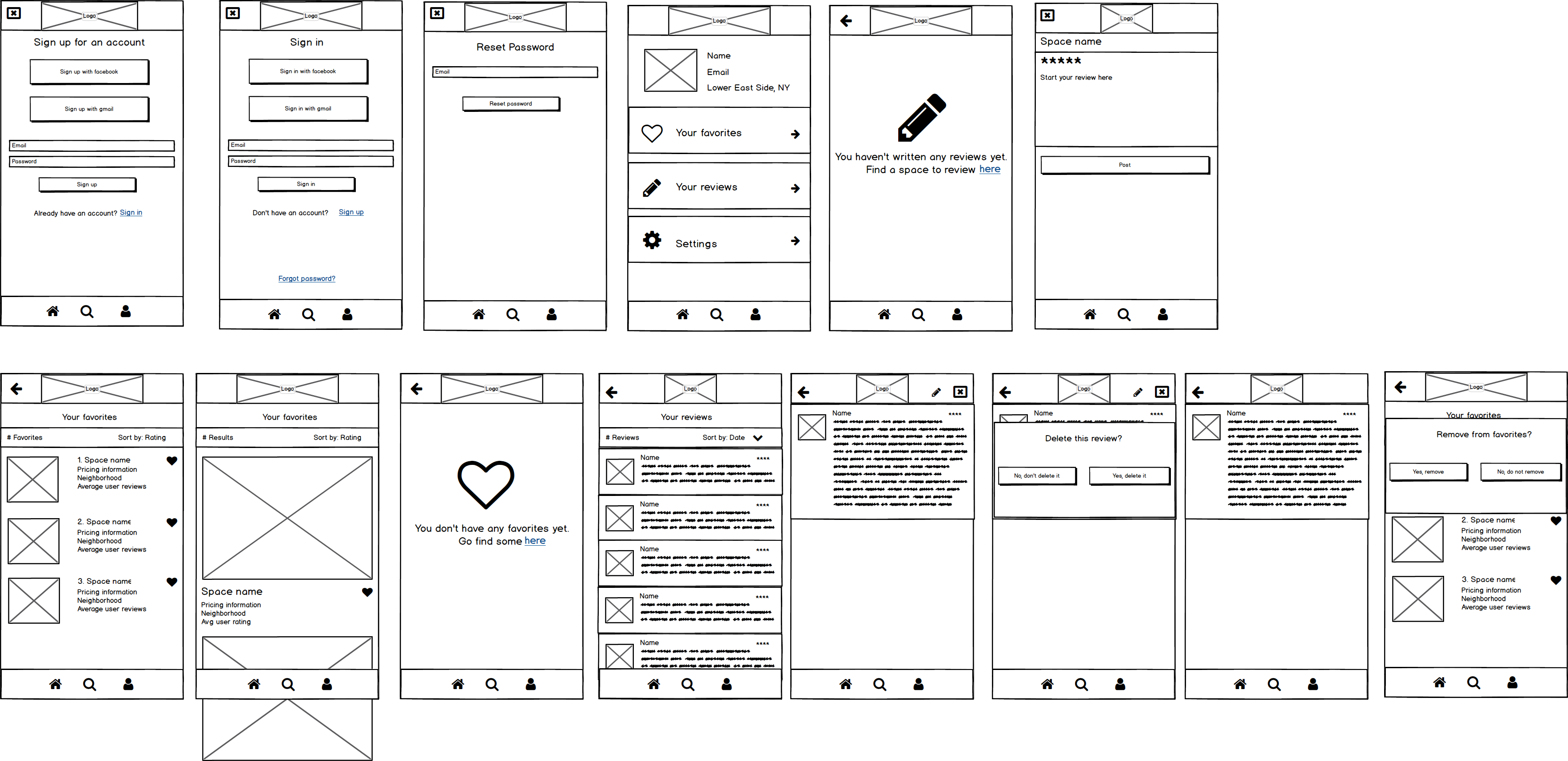
Initial wireframes for the account page setup and editing
Survey results indicated that pricing was by far the most important consideration for users when choosing a coworking space. However, pricing plans vary across coworking spaces, sometimes depending on how often a user will use the space, whether they are reserving a seat, whether they are signing up on a short-term or long term basis or other factors.
My initial solution was to look at the relative overall prices of each coworking space and use a scale similar to Yelp’s dollar sign feature to help users indicate whether they were looking on the lower end or the higher end of the pricing spectrum:
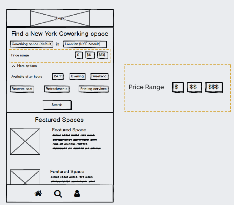
However, initial user feedback immediately made it clear that this would not work. While people have a rough understanding of what a $ meal is versus a $$$$ meal (The difference between McDonalds and Per Se) there was nothing like the same general knowledge about coworking space pricing. I had to find a way to give people numbers they could filter by. I went back to the pricing breakdown above, and looked for commonalities. Eventually, I concluded that since most of the spaces offered a daily and monthly pricing plan I could utilize this to give more targeted ranges. I went through and looked at the different daily and monthly offerings on each of these spaces to come up with these broad ranges:
- Daily Pricing: $20 - $150
- Monthly Pricing: $80 - $1,000
Users had the ability to choose whether they were looking for a daily or monthly price option when filtering, and immediately got feedback on what the price ranges would be. The response was much more positive--users wanted to have a sense of actual dollar costs, and while these ranges were broad they were effective in immediately anchoring them in what prices were likely to be, and how to think about their search.
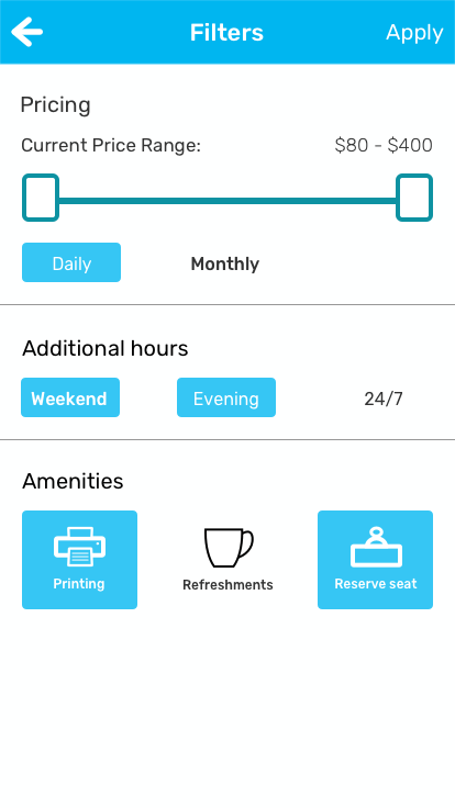
Search filters with daily pricing
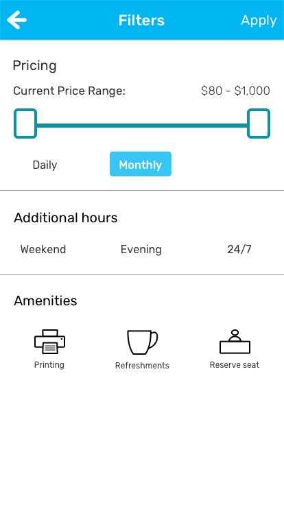
Search filters with monthly pricing
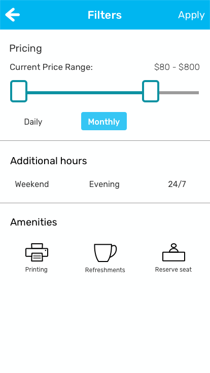
The price range can be adjusted with a swipe
The name: After many iterations, I elected to use the name Gowork for this app. It was a nice visual play on “Cowork”, and the imperative of the “go” emphasized that this was an app to enable people to leave their homes to go work.
Very early sketches and brainstorming around the logo
The final logo
Color scheme: Blue is famously associated with business, and I chose a lighter, brighter blue to underscore that this app enables a new, modern way of getting business done. I added a complimentary teal as an accent color and a strong contrasting red as a call-to-action.
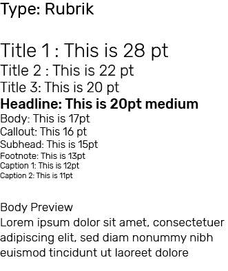
Typeface: I chose Rubik because as a san-serif with its rounded corners it is highly readable even on a smaller screen. It also offers 5 weight styles which made it easy to create a visually distinctive type hierarchy (see below image):
As a final deliverable, I built a prototype of the app using
Flinto. Flinto allowed me to design interactions for users
as they selected different screens and features.
I asked users to complete the following tasks:
Results showed that users were able to complete the assigned tasks without confusion. You can try the prototype here, using the full usability script as a guide.
The research I did into the coworking industry in New York and to benchmark apps in other verticals helped enormously in guiding this project. This baseline understanding allowed me to know exactly what gaps in my knowledge I needed users to fill, and which amenities and features I needed them to prioritize. Accordingly, when it came time to complete the information architecture I felt confident making decisions about information hierarchy and prioritization.
While I got some great feedback from my peers and my mentor on the earlier stages of the design, I would have liked to have widened the group giving feedback on the final prototype. User feedback was key to helping me re-approach the pricing filter, among other decisions. Time constraints prevented me from recruiting as many people who were entirely new to the project to review the final prototype. In an ideal world I would have liked to have observed more reactions to it.
This project represents a strong first version of an app that has great potential real world use. When prioritizing user stories for the MVP I deprioritized many that I believe would ultimately make it into a later version of this app, were it to be released. I could foresee this evolving, potentially in partnership with coworking spaces, and incorporating more search filters, amenities, or even cities beyond New York. There are many ways this could develop.