First Impressions is an e-commerce site selling rare and collectable books. I researched, designed and prototyped this site as a six-week individual concept project.
Research | Information Architecture | Visual Design | Prototyping
I designed and prototyped a website selling rare books as part of an e-commerce design project. I was drawn to working with rare books because they are deceptively difficult to categorize. While there exists a well-established system around publishing and documenting books that predates the internet, and takes into account their title, author, publication information, and (as of the 20th century) their own unique ISBNs, the value of a rare book is equally dependent on that particular book’s condition. Many rare book marketplaces give their sellers quite a bit of room to write detailed descriptions for this very reason, and often take great pains to describe warped binding, stains on certain pages, and fading on dustjackets.
I set out to create a website that achieved the following:
- Utilized existing book categorization systems to help users find specific titles
- Enabled users to filter for specific conditions and rare editions
- Delighted the user with an aesthetically pleasing and highly usable interface
The result was First Impressions, a site that incorporated a search system that took advantage of existing book categorizations, while also giving casual and avid collectors the opportunity to filter their results to find books in good or reasonable condition. It was also deliberately designed to be more aesthetically pleasing and give the impression of being higher-end than the average online bookstore, to underscore the quality of the products.
A preview of the InVision prototype I created as one of the deliverables for this project.
To start out, I conducted research on the rare book industry and best practices for ecommerce sites. After my preliminary research, I identified four competitors to use as a benchmark for my product and to use as the baseline for a SWOT analysis to help identify the best market positioning for the product:
- Amazon: An e-commerce giant universally associated with buying and selling books
- eBay: An e-commerce company that creates a marketplace for users and businesses to sell their products
- Bibliopolis: A service that builds websites for bookstores and allows users to search their combined client database to find books and buy directly from the store
- AbeBooks: An e-commerce marketplace that sells books, art and other collectables. Though owned by Amazon, it is not integrated with the Amazon flagship company and run largely autonomously
My final benchmark study and SWOT analysis can be found here.
From my benchmark study I identified common features consistently listed in the book details of my competitors:
- Attributes (e.g. Author Signed, Dustjacket, Illustrations)
- Condition
- Binding
- Publishing info (publishing house, edition/impression, year printed)
To find out how users would prioritize these features, I posted them to a SubReddit on Reddit devoted to rare books and asked the members to rank them in order from most to least important. Most users told me that if price was not a consideration, they would first check publishing information to make sure that this was the right book, and then the book’s condition was the most important factor in deciding whether that particular book was worth the purchase. Attributes were a nice to have, but would not outweigh the book’s condition or make a relatively common edition more valuable in most circumstances.
Book Collectors Prioritization:
- Publishing info (is this the title I want?)
- Condition (how valuable is this particular copy of that book)
- Binding
- Attributes (Cool! This one is signed)
- Binding(??)
Most of these book collectors considered the category of “binding,” to be redundant or largely unimportant. A serious book collector already knows what the binding of a particular book should be from the publication date (e.g. a first edition of Fahrenheit 451 from 1953 is a paperback because the book was first circulated as a paperback). While some people collect books with specialty bindings, such as tooled leather, this more of a niche collection market.
Most importantly, I got schooled in the importance of dustjackets from this user group. “A book without a dustjacket that should have one is extremely lacking in condition from the start and usually instantly loses 70-80% of its value,” one user told me.
"A book without dustjacket that should have one is extremely lacking in condition from the start and usually instantly loses 70-80% of its value.”
Finally, I got some feedback from these book collectors about what their ideal book websites would look like, which primarily boiled down to being able to easily sort and filter for the book specifications they wanted. “Sortable by book condition/jacket condition would also be awesome. So condition fields have to be defined, something along F, NF, VG+, VG, VG-, G+, G, Fair. Also, check boxes and sortable attributes on book club and ex-library would be desirable as well.”
Using both my market research and the primary user research from Reddit, I created three user personas to guide my information architecture:
- Edward Rosier, a professional rare book/artifact dealer
- Julia Packet, a book collector
- Madeleine Hanna, a casual shopper trying to find a nice book for a friend
Edward represents a distillation of the users on reddit--a professional collector who would use the site to gauge market prices for books and occasionally buy something he thought was underprice or could get a better deal for elsewhere.
Julia, a book collector, is probably the most important user for this site--someone who would buy things, but whose priorities were a mix of a rare book expert and a normal ecommerce shopper.
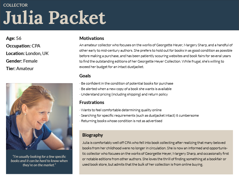
The User Persona of Julia Packet, the most important persona for site planning purposes
Madeleine is largely representative of normal ecommerce user behavior; she wants something that looks nice, doesn’t cost too much, and is easy to buy.
I referred to the user personas during the development of user stories. I prioritized specific flows based on which user personas would value or utilize the feature. They can be viewed in their entirety here. I then used these user stories to finalize my user flows.
It was particularly important to me that users be able to purchase books from the site without creating accounts.

User flows involved in the checkout process.
My research indicated that requiring users to create an account is one of the most frequently cited reasons shoppers abandon their carts (along with unexpected additional fees and a long checkout process).
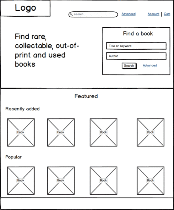
After creating the flows, I created a site map and the initial wireframes for the site.
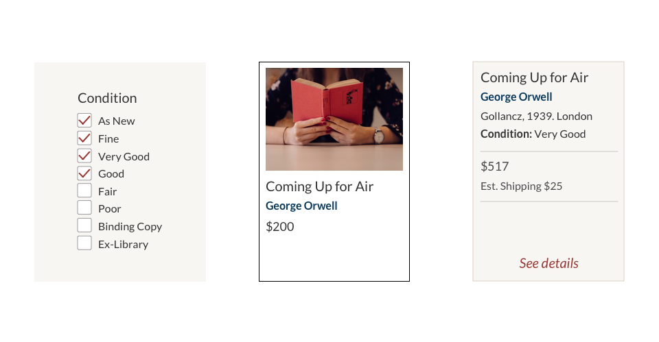
A particularly difficult problem to determine visual groups for the book details. On any particular book page I needed to have the following information: Title, Author, Edition, Condition Publication Information, Price, Collectable details, Binding, ISBN, Shipping estimate (From browser location), Dustjacket.
This is a lot of information to take in. I wanted to break these details down into logical subgroups, to help users easily browse to the information that was most important to them. To help me do that, I created a card sort activity asking 10 participants to group this information. After reviewing the results, and comparing it against the sites I used in my initial benchmark study, I came up with the below groupings:
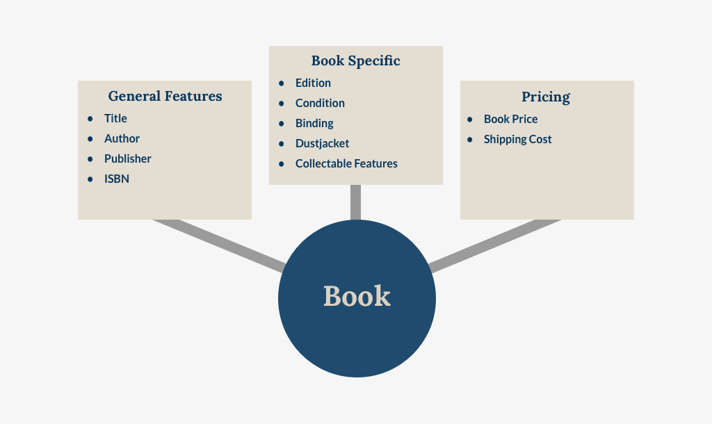
This helped me come up with a few wireframes for the detail page, which would go on to be refined later. The complete list of wireframes is here.
Finally, I took my rough wireframes and put together a very quick prototype for a user to search for a book, select the book, add to their cart, and checkout as a guest without creating an account. These were the bareboned MVP actions, and once I knew they were in place I was ready to start my visual design.
A rough prototype using the wireframes to the basic usability of the site.
I knew from very early on that I wanted the name of the bookstore to be “First Impressions.” An impression refers to a particular print run of a specific title. In the days of older printing presses it explicitly referred to how the machine had been manually arranged to produce the number of books in an order. If a titles’ initial order was for 300 copies, the publisher would print those copies and then rearrange the press for the next book. If they ran out of those copies and wanted to print more, they would rearrange the press and create the second impression. The second run would still be considered a first edition, but a second impression. This term is largely antiquated now with modern printing methods, but would allude to older, historical books, which underscores their collectability.
“First Impressions” was also the original title of Jane Austen’s “Pride and Prejudice”, which is less significant to the branding of the store but still a fun literary touch.
To bring this name to life, I used IM FELL DW Pica. The Fell Types were developed by Peter De Walpergen and John Fell for Fell’s Oxford-based “learned press” in the 17th century. Unsurprisingly, given the age of the Typeface, it’s design evokes history, and some of the effects of aging.
The final logo.
The edges of the strokes waver visibly, suggesting the press had been worn down or cut by hand. I’m particularly partial to the slight nick in the dot of the “i” that prevents it from being a fully formed oval. The character appears twice in “First Impressions”, in both words, and creates a nice near symmetry between them, as well as drawing the viewer’s eye above the cap height over the other lowercase letters. In the case of “Impressions”, which is a longer word, this also helps lend some needed visual variation.
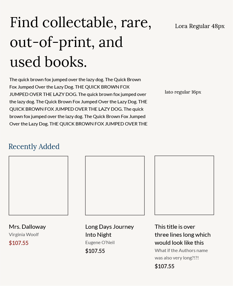
I went back and forth on which typefaces to use for the header and body text before settling on Lora and Lato, respectively. I chose Lora because I wanted the headers to be in a serif font, so as to be reminiscent of books and printing in general. Lato pairs very well with Lora and also works well on screens even at smaller sizes. Additionally, the double-story character “a” and “g” keep the font reminiscent of serif fonts and classic prints.
Early examples I experimented with the Lato/Lora pairing.
I wanted a color scheme for the site that would evoke a similar sense of history as IM FELL DW Pica, but would still be visually appealing and navigable on screens. After looking at different sites and pictures for inspiration, I ended up relying heavily the art of Jacques-Louis David. While David as a late 18th and early 19th century painter certainly brings a sense of history, I was mainly drawn to his work in this instance because of his use of reds, blues and browns, which were often similar in shade and intensity to the bindings of older books.
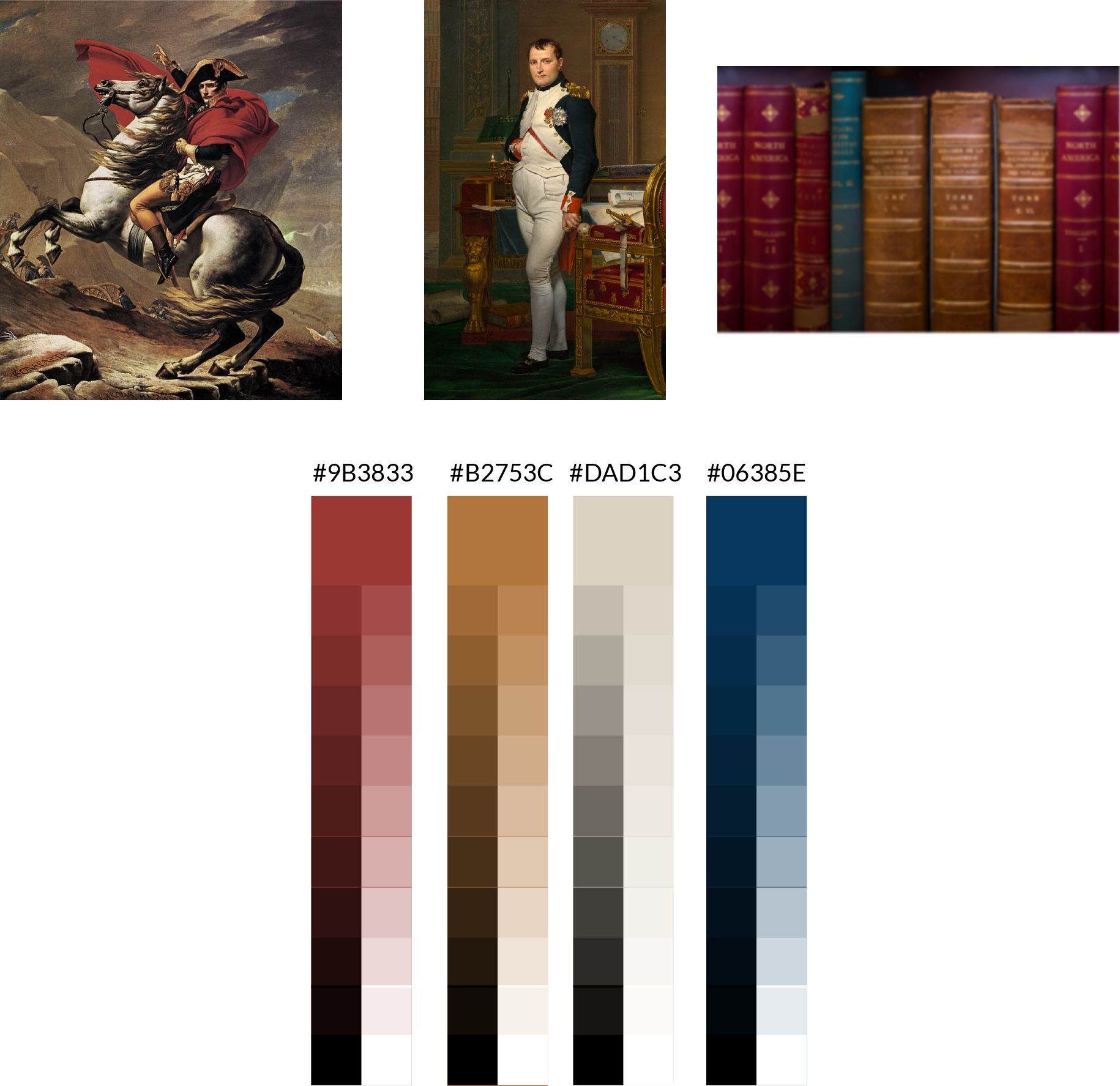
My final color pallet was informed by the way David uses blues, reds, and browns.
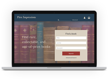
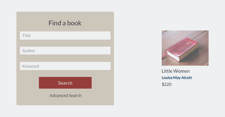
The homepage needed to have a brief description of the site and what it does, a prominent search display that demonstrated how users should best use the site, and some initial content they could browse.
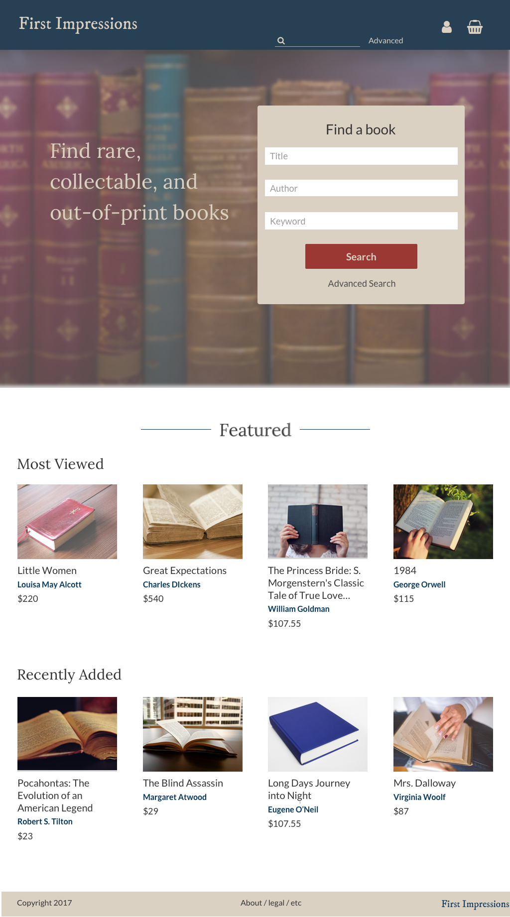
I used red as my CTA color throughout the site, blue for accent color, and tans and yellows as background on featured or important information.
Throughout the site I highlight authors’ names in blue. I did this not only to introduce some variety into a very text-heavy site, but also because author, rather than title, is the best indicator to users that they’re looking at the correct book. Books can have similar or even the same titles, and not all users are likely to know the publisher or ISBN of their book--the user persona Madeleine certainly wouldn’t--so author is the best, fastest way to guide users to the right selection.
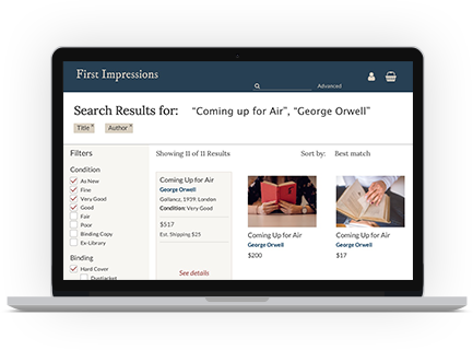
In my original wireframes I utilized a simple list view for book results, similar to AbeBooks, Bibliopolis, and eBay. However, it dawned on me that a grid view result not only allowed the viewer to see more results at once, but also had a cleaner, more visually appealing affect that could stand out strikingly against other rare book sellers.
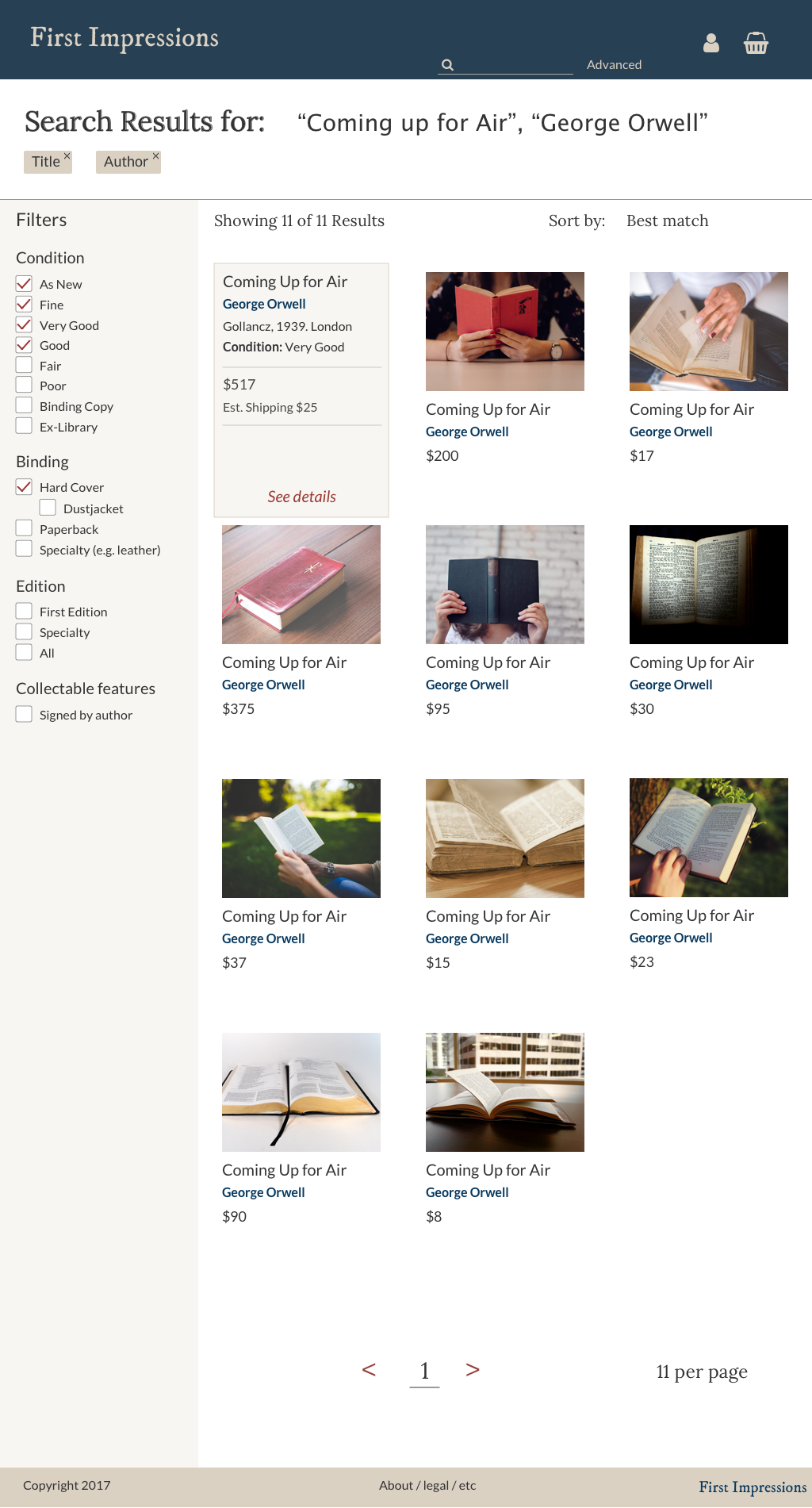
Accordingly I set to restructure the information granted for each book in the listview, keeping author, title, and price immediately apparent, and offering publisher and condition when viewers hovered. That would still allow users to quickly scan for important information, made the page much cleaner overall.
Sample assets from the search results page.
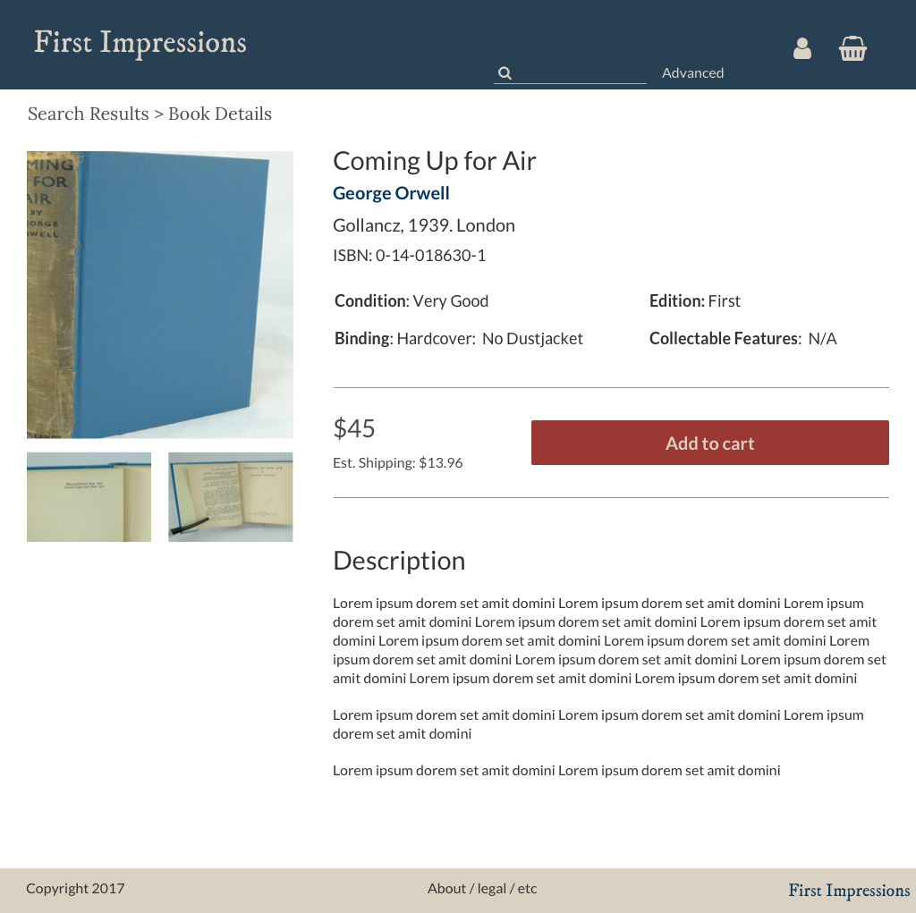
I also significantly reworked the detail view of the book. Though my initial wireframe had called for putting the price next to the image and the pertinent details and description underneath, the pricing alone next to the picture looked empty.
Instead I pulled all the books publisher information and individual information up next to the main book picture, keeping the detailed description alone below. In order to keep the information visually separated into the categories I’d determined during the card sort, I utilized extra spacing between the publisher information and books specific condition, and used borders above and below the pricing to literally separate it.
As a final step in this project I put together a prototype in InVision to:
- Search
- Filter
- Add to cart
- Create account
- Finalize purchase
A preview of the first two steps in the usability test.
After conducting tests with sample users I concluded that the site-map, interactions, and visual designs sufficiently guided users through the key user-flows being tested.
The full prototype can be found here. The accompanying usability script can be found here.
It was important to me that the visual design of this site be impressive and evocative of a higher-end shopping experience. Many e-commerce sites are almost cluttered in their visual layout, because they want to maximize the information the user takes in to encourage additional spending. Rare books do not really lend themselves well to this, because they are generally a bit more expensive, and not something where people are as inclined to impulse-buy. I think the typesystem, use of whitespace, and interactions create the sensation of a high-end shopping experience.
While I chose a grid layout for the search results page to keep the overall visual design cleaner, in an ideal world I would have liked to A/B test the two layouts to see which users were able to navigate faster. Although I still believe that the grid design is more visually appealing, it’s not as easy to scan through all the pertinent details for each book.
I think the work I did on this site design would make it an effective used and rare book store. Were the site to be launched in real life, I would anticipate that over time we would add more features, such as the ability to search by publisher, adding additional filters to the search results (e.g. language), and building out the featured content on the homepage to try and encourage browsing.